UX/UI Design
Accessibility & Inclusion Study
For a midterm assignment, I used a provided wireframe to create a high fidelity of an hypothetical hotel reservation website. My main goal for this assignment was to create a product focused on accessibility, especially something that was considerate to those with visual impairments. In an effort to make sure I addressed as much as I could, I made sure to reference the Web Content Accessibility Guidelines (WCAG) 2.1.
The Problem
While referencing the Web Content Accessibility Guidelines (WCAG) 2.1, I needed to take an already existing wireframe and created a high fidelity version that optimizes accessibility and inclusivity accommodations through my own design efforts.
-
UX Researcher, UI Designer
-
Sketchbook, Figma
-
2 weeks
The Solution
Wireframe
This wireframe was given to me by my instructor, I did not create it. The purpose of providing me with this wireframe was to challenge me to take something that already exists, using elements that have already been established as important, and to use that as a framework to further build out a product that accounts for achieving the highest level of accessibility and inclusion as possible.
High Fidelity
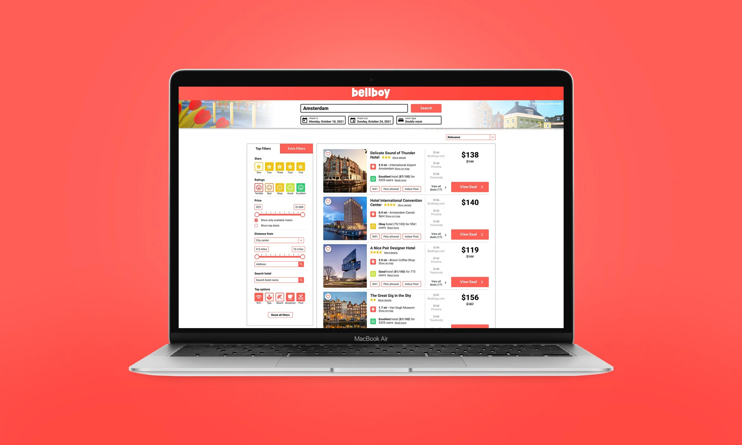
My main goal for this assignment was to create a product focused on accessibility, especially something that was considerate to those with visual impairments. My main tactic for accomplishing that was to ensure that nothing in my product relied on color alone to indicate anything, it was used purely as decoration. Also, I wanted to implement high contrast in colors, especially for text, as the wireframe had a lot of light gray on white. Lastly, the icons within the “Stars” section were quite small and hard to distinguish, so I made them all one bigger star with a number inside of them.
Another group of disabled users that I wanted to account for were the mobility impaired. I thought it’d be effective to have the “Price” and “Distance” slider’s text field’s editable, as I know that sliders can oftentimes be challenging to navigate. Hopefully, even for those in the aging population, this will reduce the stress on wrists and fingers and ideally could be accomplished through the use of keyboard navigation.
There was another edit that I had made, but I’m not quite sure what accessibility context to put this in. I changed the “Rating” language to be a bit more dynamic. For instance, I changed “Good” to “Okay”, “Very Good” to “Good”, and “Very Good” to “Excellent”. I did this because I thought that it created more levels of separation than the old way had. I often feel as though language and tone get overlooked, not just in terms of accessibility, but in general. It is just as important to a brand as anything visual.
I’d like to point out a few other areas of concern that I have addressed. For one, I decided to make the hearts more visible than how they were designed in the wireframe to separate them a bit more from the image they were overlaid upon. I also removed the gray interface background and placed the panels on a more simple white background. I then changed the various face icons in an effort to make them more distinguishable. Lastly, I removed unnecessary borders within the results panel because it felt a little overkill and I thought it’d be a less complicated solution for the visually impaired.
Conclusion
In the end, I’m quite satisfied with how this came out—for a quick little assignment, it provided me with a ton of value. I’ve learned that, oftentimes, accessibility and inclusion efforts are thrown in at the end the process before launch. However, it makes all the difference to consider accessibility and inclusion throughout the entire process. One of my “ah-ha!” moments that I’ll take with me throughout the rest of my career was realizing that accessibility efforts aren’t limited only to disabled users. Creating a great experience for deaf users may also benefit non-deaf users who may be on a loud and crowded train, for example. When all is said and done, isn’t that what it’s about, creating wonderful experiences?


