UX/UI Design & Web Development
Chang's Garden
Chang’s Garden was looking to elevate their web presence in the wake of increased competition that had arrived at Storrs Center. My task was to redesign and build a new website that is more representative of the quality and value of their establishment. As part of the web design process, I created style tiles, wireframes, a flat design, and a coded final website that is a mobile-first, responsive implementation of my design.
The Problem
Chang’s Garden’s current website is quite clunky and outdated from a visual standpoint. However, more importantly, the user experience was also lacking quite a bit. I needed to update their website to bring it into modern times to represent the quality and value that their business brings to the community. Chang’s Garden is located in Storrs, CT, a college town filled with young adults with plenty of dining options, whose main point of contact is through digital marketing. Therefore, it was imperative that I built a mobile-first refresh of their website from the ground up.
-
UX Researcher, UI Designer, Web Developer
-
Adobe XD, Visual Studio Code
-
4 weeks
The Solution
Style Tiles
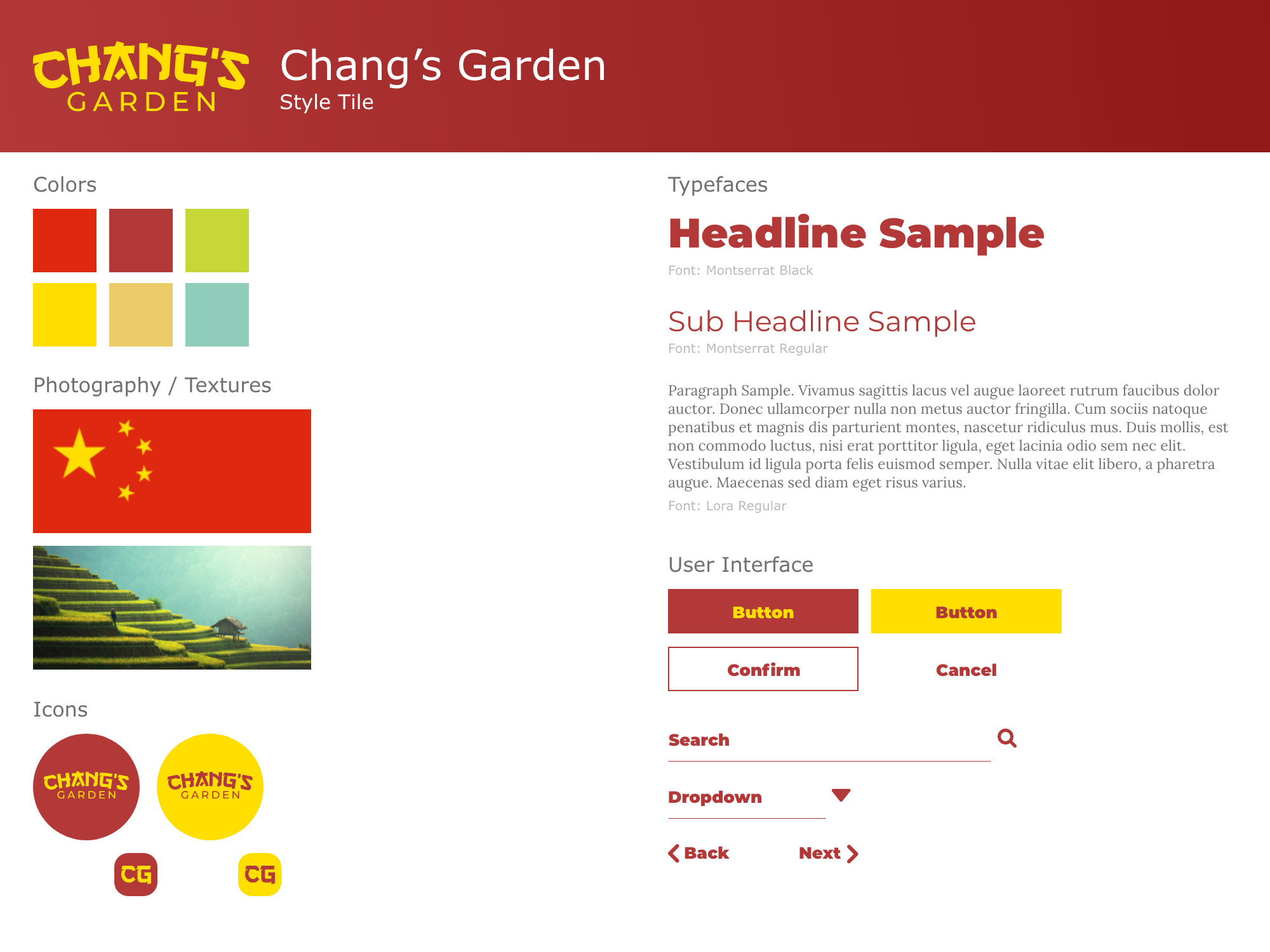
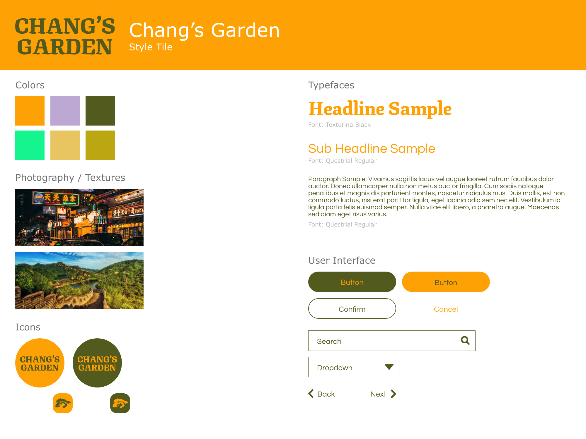
For the two style tiles that I created, I wanted them each to have a very different feel. The first style tile’s colors were influenced by the Chinese flag, while the second was inspired by the colors of noodles and vegetables. The type treatment for the first was influenced by traditional Chinese letterform styles, however, the second took the form of a more natural, agriculture look and feel. For both, I wanted the typefaces to balance both serif and sans-serif and compliment each other in that way. Then, for the different UI elements, I wanted something very simple and straight-forward that was easy to digest.
Wireframes
I designed these wireframes with the goal of rearranging information more effectively. Information was separated into clear blocks of rows and columns, and they were begging for more space to breathe. Additionally, it was important that I drew more attention to various calls-to-action, especially when it came to ordering online and ordering by phone.
High Fidelity
This is usually my favorite part of the process, and that was no different with this project. Realizing this unique navigation bar, as well as the complimentary sweeping hero image, made it feel like I was finally cooking with gas. It can be challenging placing in real copy and trying to make everything fit nicely, however, I think it was well executed in the end. I was happy that, at the end of the high fidelity process, the project was maintaining the cleanliness that I was hoping for.
Conclusion
This was a fun project because, just by comparing the old version to my updated version, it’s clear that I made a lot of changes. In the end, I believe that the new version of Chang’s Garden’s website is a noticeable improvement and it should serve as a better resource for them to achieve their revenue goals. This is a great example of what makes my work so enjoyable, I get the opportunity to realize what clients have in their minds and bring them into reality, and therefor, create great experiences for their customers. I learned a ton from this experience, especially on the web development end, as it is probably the most extensively coded project I have worked on to date.


